
 A most exciting innovation of watercolor paints are the sparkling, absolutely lightfast and tarnish free interference colors including the silver and gold. They have to be viewed at an angle for the sparkle to show. Viewed straight on, they produce a slightly muted effect.
The challenge for artists is to make them work both ways in a painting.
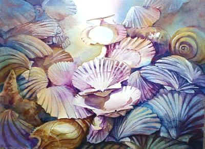
To the right is an example of a painting in which I used interference paints in the “Shells” 11″X15″.
 The way Interference paints achieve their sparkle is fascinating. It is caused by a special surface on the pigment that causes lightwave interference. An easy way to understand this is to think of the waves caused when you drop a stone into a pool of still water. Positive wave interference occurs when you drop in a stone at exactly the same spot and the second waves are in sync with the original ones causing more powerful waves. In the case of lightwaves this makes for the appearance brighter light. Negative lightwave interference occurs when the second waves are out of sync with the original ones causing a reduction in the waves’ power or in the case of light- a reduction in brightness. The combination of positive and negative interference causes the pigment to appear to sparkle.
The special pigment surface that causes lightwave interference consists of flat transparent mica particles, coated on both sides with highly refractive titanium dioxide. Different thickness in the titanium layer give the appearance of different colors. In the gold and copper toned interference paints the titanium is replaced by either yellow and red iron oxide pigment.
Daniel Smith Inc. is the only company that manufactures the transparent colored interference paints. Daniel Smith and a number of other brands offer silver and gold paints.
Sunflowers and Trumpets
The painting “Sunflowers and Trumpets” illustrates how “interference” paints add a new dimension to realism-flower petals do indeed sparkle. The painting also shows how the addition of interference colors adds depth to regular colors and enhances color quality.
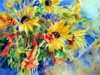
11″ x 15″ watercolor by Hilary Page.
Procedure: I picked this colorful bunch of Texas flowers growing near some railroad tracks. The painting was completed rapidly in three simple stages before the flowers wilted! Before starting I viewed the flowers and vase through a small visualizing mat and mentally noted how I would crop the arrangement for the painting.
Materials:
-
-
- A piece of 11″ x 15″ 140lb cold pressed watercolor paper
- 1″ flat brush (or a larger flat brush)
- No. 8 round brush with a fine point
- 2B pencil
- A fine spray bottle
- The paints listed in the palettes below
-
I squeezed the colors into the upper portion of separate, tilted, palettes (white plastic container lids will do) and mixed them as required with a little water.
Palette 1: Sunflower colors
-
-
- Hansa Yellow Light
- Hansa Yellow
- Interference Gold
- The center of the flower which I did not mix is Daniel Smith’s Moonglow.
-
Palette 2: Orange Trumpet Flower:
-
-
- Organic Vermilion
- Hansa Yellow
- Interference Red
- Gold
-
Palette 3: Greens:
-
-
- Hansa Yellow Light
- Ultramarine Blue
- Interference Green
- Substitute Hansa Yellow with a touch of Organic Vermilion for a duller green.
-
Palette 4: Blue background color:
-
-
- Ultramarine blue and Interference Gold for the wet on wet wash
- I used Ultramarine Blue and Interference Blue for subsequent applications.
-
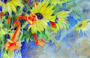
Stage 1
I made no pencil drawing. After pre-wetting the front and back surfaces of my watercolor paper which I then laid on a slick surfaced board, I applied the paint in a wet on wet wash using the colors and interference paints described for each palette. I made sure I had enough paint ready because the paper can dry out if you have to take the time to squeeze out and remix paints! Besides imparting a sheen, the presence of the interference paint makes the regular watercolor behave in a more controlled manner in wet on wet applications. To avoid back run water marks round the edges, I placed an absorbent flat cotton rag on the board and then put the wet painting on top. When the painting was dry, I penciled in the lines for guidance.
Stage 2
Using the same colors only darker as in stage 1-I “negative painted” the flowers, leaves and vase by painting around them. I added darker shades of orange and yellow to the flowers to add form.
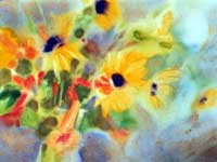
Stage 3
I continued negative painting and adding details. The pollen in the center of the sunflowers is a combination of Interference Gold and Hansa Yellow Light used opaquely. The beautiful blue color is Ultramarine Blue and Interference Blue also used opaquely. The blue and yellow enhance one another and are particularly pleasing together because the colors visually complement one another. They are “Visual Complements” (See article on Visual Complements).
 |
 |
|
| STEP 1: Apply the paint in a wet on wet wash using the colors and Interference paints described for each palette. | STEP 2: “Negative paint” the flowers, leaves and vase by painting around them. | STEP 3: Continue negative painting and adding details. |