
Welcome to WEB UPDATE
For Update Lists email:
SEE PAGE 10
![]() page 1
page 1
“Web Update” is the original update for Hilary Page’s Guide to Watercolor Paints published by Watson-Guptill publications. It covers the paints that have been either upgraded or introduced since the Guide was first published in 1997. Please scroll through the material for your personal use. Commercial use or reprinting of the material is prohibited without prior permission.
THE DIFFERENCE BETWEEN VISUAL & MIXING COMPLEMENTS ARTICLE click HERE
SPARKLING INTERFERENCE PAINTS ARTICLE click HERE
HILARY PAGE’S BOOKS: click HERE, VIDEOS: click HERE, LIST OF ALL ARTICLES:click HERE
ABOUT “WEB UPDATE”
To the 1,600 paints tested (of which some 1,400 were featured) I have now tested an additional 1000 paints. These additional paints are the subject of “WEB Update ” (below) and “update lists’ (available via email). Unlike the book, Hilary Page’s Guide to Watercolor Paints that shows a detailed visual sample for each of the 1,400 or so paints, “WEB Update” here shows just one representative, handling sample from each brand. I have, however, tested the additional paints using methods identical to those described in the Guide though in the web update shown here, I only give detailed descriptions of individual paints when they are exceptional for either positive or negative reasons. Unfortunately, the “exceptional” often dwells on the individual problem paints whereas, as was shown in my Guide, most paints now on the market are perfectly acceptable. The colors are reproduced to match the original as nearly as possible. The “update lists”, available by email, are comprehensive and cover information on all the paints tested since my Guide was published.
PAINT IDENTIFICATION:
The paints in this update are identified, first by the manufacturer’s code number if designated, next by the name picked by the manufacturer, and finally by the internationally recognized Color Index Name(s), displayed on every new tube or pan paint though you may need a magnifying glass to see them! The CI name identifies the pigment(s) used such as PB28 (Pigment Blue 28: Cobalt Blue). The early pigments of each color that were numbered a long time ago have lower numbers and the most recently introduced ones have the higher numbers. The CI name is the only accurate way of distinguishing one paint from another for comparison.
PAINT TESTING:
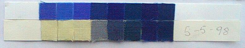
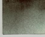
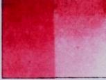
The lightfastness and handling tests were done on Arches 140lbs cold pressed paper. The lightfastness samples were divided into two. One half of each was stored between acid free paper in a drawer and the other half was exposed to sunlight. The samples were displayed under identical conditions and the Blue Wool strips [BELOW] that fade progressively, were used to measure the amount of sunlight to which all the samples were exposed to ensure uniformity. You will notice that the seventh band is just starting to fade indicating that the samples have been exposed to a great deal of sunlight- the equivalent of a few hundred years had they been exposed to indirect light and protected by glass in a home.
PAINT SAMPLES:
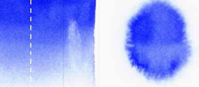
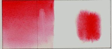
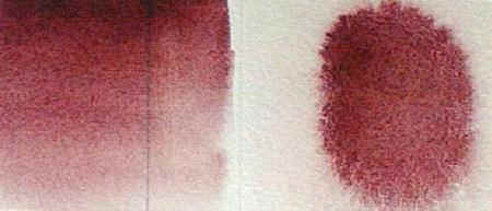
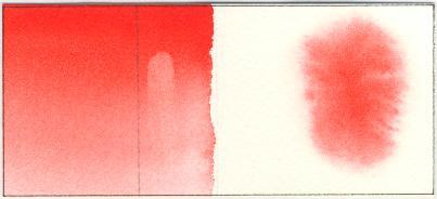
Each representative handling sample such as MaimeriBlu’s 391 Ultramarine Light [BELOW] is divided into two. The left portion shows a graded wash ranging from full strength to tint. The wash covers a pencil line (it’s a bit hard to see) to show relative transparency. There is also a lift off portion where the wash is re-wetted after it has dried and then the paint wiped off with a tissue. The right hand portion shows how the paint behaves in a wet on wet application. When dried and pressed flat I cut the sample at the broken white line. I exposed the left hand side to sunlight. I stored the rest of the sample in a drawer where it received no light. When the sunlit portion had received the requisite amount of sunlight as measured by the fading amount on the blue wool, I compared the two portions and made comments, as below.
![]() page 2
page 2
SAMPLING OF THE NEW BRANDS AND PAINTS
MaimeriBlu 15ml tubes: 72 paints .
The old line has been re-introduced as the MaimeriBlu brand. The paints contain excellent lightfast pigments that give quite a wide range of beautiful, vibrant colors. The paints are ground to be uniformly smooth, even the inorganic ones such as 391 Ultramarine Light PB29.

There’s little texture in this range! Many of the paints, especially the synthetic organic ones sink into the paper and will not lift off when re-wetted and wiped off with a tissue. When applied wet on wet they form inward moving watermarks with some of the pigment shooting across the water surface.
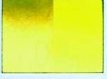
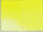
A paint in the MaimeriBlu range that I particularly like is 114 Permanent Yellow Deep PY139. This is a new synthetic organic isoindoline pigment and at present is unique to MaimeriBlu and Daniel Smith’s Isoindoline Yellow. It is an excellent match for Cadmium Yellow Deep PY35 but without the cadmium’s toxicity.
 114 Permanent Yellow Deep PY139
|
 084 Cadmium Yellow Deep PY35
|
112 Permanent Yellow Lemon PY175 (the same pigment as Winsor Lemon) is another favorite since it is the perfect substitute for Aureolin which is impermanent (see below). I also like 460 Mineral Violet PV16 (manganese) and 440 Ultramarine Violet 440 (PV16) because the colors are attractive. Note that the paint 374 Cobalt Blue Deep PB28 is made with the same pigment as in 373 Cobalt Blue Light PB28. The Cobalt Blue Deep PB73 pigment is not used in this range.
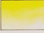
A paint that I would avoid is [RIGHT] 082 Cadmium Lemon PY35 (MaimeriBlu). This paint turned dull and greenish when applied in mass tone, as shown.
Venezia 15ml tubes, 36 paints
(Maimeri 2nd range)
The paints contain good, lightfast pigments that give clear colors and for the most part, apply smoothly. Although the tubes are the same size, the pigment concentration is much weaker in mass tone than the MaimeriBlu range; and there are more “mixed” colors and less single pigment paints included; but this is what you would expect for a 2nd range. They’re cheaper too!
One Venezia paint of note is 062 Permanent Orange PO36, a benzimidazolone, which is a very lightfast red-orange.
Unfortunately my particular sample was rather gritty and weak. This pigment is usually fine and is just starting to appear in paints.
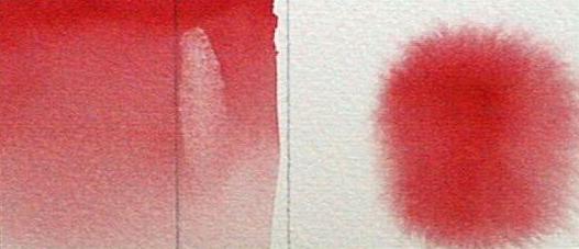
MaimeriBlu’s 125 Orange Lake PO43 (perinone) [RIGHT] tends to darken and is not nearly so lightfast as Venezia’s Permanent Orange PO36 shown above. Here is an instance where the pigment in the 2nd range of paints is superior.
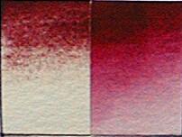
There are a couple of paints to be wary of: 174 Crimson Lake PR254,PR206 [ABOVE] is not crimson at all (despite the crimson color on the tube). Rather, it is a combination of Pyrrole red PR254 and Brown Madder Quinacridone PR206 and so it is a slightly dull yellow-biased red.
Venezia’s 416 Cerulean blue has a misleading name. Not in compliance with the ASTM labeling requirements, the name gives no indication that it is not made with the expensive pigment usually associated with “Cerulean” (oxides of cobalt and tin). Instead it is made with the much cheaper and less evocative pigment, phthalocyanine blue red shade PB15:1 with white added to make it appear like genuine Cerulean. I should add that the tube does show the pigments included but the majority of buyers do not check this. Here’s a reason to start checking now!
Holbein 5ml & 15ml tubes: 24 new paints The new paints extend the watercolor line to a total of 108. All Holbein paints are extremely well made. They handle superbly and the unique character of each individual pigment such as textural or smooth is beautifully preserved. 48 Antique Irodori paints covered in LISTS.
Holbein: Cherry Red
Cherry Red is made with the same pigment as Winsor & Newton’s Quinacridone Red PR209 and Daniel Smith’s Quinacridone Coral PR209. You might be interested to know that Daniel Smith’s Quinacridone Red is actually PV19, a different color! You can see how confusing paint names are. That’s why you need to identify paints by the Color Index Name referred to earlier.
The newest Holbein paints also include an iridescent Silver and Gold (interference colors) and some “mixed” pastel colors as well as the latest new pigment colors- Rose Violet PR122 (the same as Winsor & Newton’s Quinacridone Magenta PR122 and Bamboo Green PG36 (Winsor-Phthalocyanine green yellow shade) and a Permanent Alizarin Crimson. They are very good. You can check the colors of these pigments in the Guide.
Holbein: Marine Blue PB16 [RIGHT] is another beautiful color. The pigment is metal free phthalocyanine. It is also used in paints in the MaimeriBlu, Schmincke and Old Holland brands.
A Holbein paint I particularly like is [RIGHT] Brilliant Orange PO73, PO62, a Pyrrole orange and a Benzimidazalone orange. It is similar to Perinone Orange- very slightly less red but it is much more lightfast. Saturated (pure), lightfast red-oranges are hard to find.
Shadow Green PBk31 [RIGHT] is a perylene pigment that is unique to Holbein and could be useful if you want a ready made uniform neutral shadow color.
Holbein’s beautiful, luminous Bright Rose and Bright Violet are fugitive and clearly marked as such. They should be avoided unless for short-term display. Another more serious caveat: the following four paints in the established-not the new ones- line are not marked as fugitive, but according to my tests they have inferior lightfastness when compared to other paints on the market. These are Crimson Lake PR83, Carmine PR83, Scarlet Lake PR48 and Permanent Rose PR60. Note also that this “Permanent Rose” is not a Quinacridone paint. I mention these out of frustration really, because otherwise Holbein paints are so superior and handle so superbly.
American Journey 37ml tubes: 51 paints (Cheap Joe’s)
In large 37ml tubes, Cheap Joe’s American Journey line offers 51 paints made with lightfast pigments. These paints have a uniform, smooth consistency and they handle OK as shown in the sample though generally they are a little pasty at full strength and act as if they contain a lot of extender. The number of subtle-colored, individual pigments used in the range is not extensive. I class the range as good quality student paints.
Especially memorable are the names! Red Hot Momma PR188, Fire Engine Red PR188,PV19 and Bumble bee Yellow PY97 to name but a few! Several paints are named for the artists’ who use them such as Andrews Turquoise, Getz Grey and, of course, Joe’s (phthalo) Blue PB15 and Joe’s (phthalo) Green PG7! However, I have reservations about a few names. Brown Madder Quinacridone PR101, PV19 for instance [ABOVE], is named as if it is just a quinacridone pigment when in fact it is made with both “Indian Red” PR101, a relatively inexpensive red iron oxide pigment and Permanent Rose (quinacridone) PV19. The dark mass tone color of Manganese Blue PB33, PB15 (phthalo) indicates that the paint is mainly phthalo blue but this is not evident from the paint name. I should add that the pigment content is indeed clearly listed on the tube. However, the ASTM specifies that after the paint name, the words “Hue” should be used if the paint contains pigment substitution and “Mixed” if more than one pigment is used from the generally understood pigment content implied by the name.
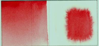
An unexpected problem occurred with American Journey’s Cobalt Violet PV14. [RIGHT] The usually permanent Cobalt Violet here applied perfectly at first but discolors and fades when exposed to light and sunlight.
Wild Fuchsia (American Journey) is a beautiful, brilliant pink. That the paint is fugitive is clearly marked on the tube and in the catalog. Though a tad less lightfast, it is similar in color to Holbein’s Opera.
 Wild Fuchsia (American Journey)
|
 Holbein’s Opera
|
Typically there is a problem with Aureolin. The good news is that American Journey’s “Aureolin” PY40, PY3 is a mixture of both Aureolin Cobalt Yellow PY40 and the more stable and cheaper PY3 though this is not indicated in the paint name. The bad news is that the paint contains enough Cobalt Yellow for the pigment to react with the medium causing the tube to almost explode! And it’s expensive too!
 American Journey’s”Aureolin” PY3, PY40
|
 Hansa Yellow Lemon PY3
|
Both colors are green-biased lemons betokening limited mixing potential for bright orange colors.
![]() page 6
page 6
AUREOLIN ALERT! THE DEFECTIVE PAINT!
Here I will digress a little to give you a general warning about Aureolin PY40 (Cobalt Yellow) in ALL brands. Despite the ASTM ‘s good recommendation (rated ASTM II), my tests show, and manufacturers agree, that the pigment Aureolin PY40 turns BROWN and FADES even in a dry state.
The best substitute for Aureolin is PY175, as in Winsor Lemon PY175 (Winsor & Newton), or in Permanent Yellow Lemon PY175 (MaimeriBlu), (Schmincke’s) Chrome Yellow Lemon (no lead) PY175, (Cotman’s) Lemon Yellow Hue PY175 or Daniel Smith’s Lemon Yellow PY175. PY175 is cheaper than Aureolin too!
Note: a few brands list an “Aureolin Hue”. Usually it is made with a warmer, more orange-biased yellow, PY97 or PY151. These are not the best substitutes. They do not match Aureolin PY40 so closely and so do not work nearly so well for color mixing as does PY175 as in Winsor Lemon. The actual color of both Aureolin and PY175 is a warm lemon that will mix with reds to produce bright orange colors, and will mix with blues to produce fresh, vibrant greens.
 Aureolin (cobalt yellow) PY40
|
 Winsor Lemon PY175
|
COTMAN-8ML & 21ML: 17 UPGRADED PAINTS Winsor & Newton’s 2nd range.
The paints handle well as shown in the sample and they are reasonably priced. The less lightfast paints of the original Cotman line have now been replaced with permanent colors. As you would expect with “bargain” priced paints the pigment content is not as great as with the Winsor & Newton “Artists’ ” but the color clarity is good. The number of individual pigments used is not extensive and more colors are achieved through mixtures than with single pigments. But for a 2nd range paint line they are good value for money. And if you are unable to find a Winsor Lemon PY175 as an Aureolin substitute, then you can use Cotman’s 348 Lemon Yellow Hue. This is also PY175!
The labeling is in compliance with the ASTM labeling standards so each pigment used is listed, even if in minute type! Any substitution of expensive pigments for cheaper is indicated by the use of the word “Hue” or “Mixed”.
Cotman’s Cadmium Red Hue PR149, PR255 [RIGHT] is so named- with the word “Hue” at the end of it- because the paint matches Cadmium Red but does not contain expensive, toxic cadmium pigment.
The CI name “PR255” for the red pigment Pyrrole scarlet was designated a few years before 1994 when the pigment first appeared in artists’ paints.
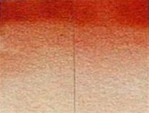
I recommend the Cotman’s Permanent Alizarin Crimson (a pyrrole and quinacridone mix) [BELOW]. Compared to the genuine Alizarin Crimson PR83, it is indeed permanent. Both have been exposed to the same amount of sunlight. My sample of Rose Madder Hue (Cotman) was not especially lightfast. This is surprising since it is comprised of the same pigments as in Permanent Alizarin Crimson which as shown, tested out very well.
 Alizarin Crimson PR83
|
 Cotman’s Permanent Alizarin Crimson
|
 Rose Madder Hue
|
ROWNEY 5ML,15ML: 80 PAINTS- 34 NEW & 19 IMPROVED.
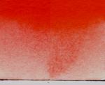
For individual evaluations of the new Rowney paints email Hilary Page for lists (see page 10).(Right) The paint name has the word “Hue” after the name to denote that it’s not genuine “Vermilion”. It’s much better! It is the practically indestructible Pyrrole scarlet PR255! The color is beautiful, and it handles well as shown in the sample. See LISTS
DANIEL SMITH:14+ NEW PAINTS: Green Gold PG10 has been replaced with Rich Green Gold PY129, the same color as Winsor & Newton’s Green Gold! Phthalo Blue red shade PB15:1 has been added as have some lovely new natural earth colors. The color of two of the new colored iridescent paints are fade somewhat (see lists- email me for them) The color fades but not the sparkle!
![]() page 8 APPENDIX
page 8 APPENDIX
PAINT QUALITY: “Professional Artists’” versus “2nd range , “Budget” Paints: NO STANDARDS!
Here is a good place to discuss paint quality because this update covers both a 1st range brand, MaimeriBlu, and a 2nd range brand, Venezia, that are made by a single manufacturer, Maimeri, and marketed in the same sized tubes.
The problem with quality is that there are no recognized standards to define the differences between so-called “Professional Artists'” and so-called “Budget” , 2nd Range” or “Student” quality paints! The specific designation is left to the discretion of the manufacturers. The ASTM (American Society for Testing and Materials) doesn’t help consumers in this regard at all. All the manufacturers have to do to comply is to follow a few minimum standards covering lightfastness, general handling and labeling. Then they can advertise their paints as “Artist” quality. Thus Maimeri could market both 1st and 2nd range brands as “Artist” quality and still be in compliance with ASTM standards.
The confusion is even more marked when a manufacturer offers only one range of paints. To help you gauge for yourself whether a particular range is 1st or 2nd quality, I have listed major differences to help you identify 2nd range paints.
-
-
- They contain less pigment and more extender. Tube size does not reflect pigment concentration.
- They have fewer individual pigments and colors.
- Many colors are achieved by physically combining pigments in mixtures.
- The practice of substituting cheaper pigments in place of some of the expensive ones is common place. It should be noted that cheaper pigments are not always inferior.
- The paints often do not handle very well, especially in wet on wet applications.
- 2nd range paints are often advertised as “bargain” or “budget” priced.
-
I must stress that there is a place for both 1st quality and 2nd range “bargain” paints. While I personally use 1st range paints because they have more subtle colors, superior color clarity, handling and a higher concentration of pigment, I have seen perfectly fine paintings produced with “budget” paints. You can also be assured that these days, practically all paints are lightfast in both 1st and 2nd range paints. The choice is yours!
![]() Page 10 How to obtain the “LISTS” see below-
Page 10 How to obtain the “LISTS” see below-
![]() page 10 BE INFORMED AND SAVE MONEY!
page 10 BE INFORMED AND SAVE MONEY!
I hope you find “Web Update” useful. Remember it is limited. I provide comprehensive information in my GUIDE and the LISTS that accompany it. You will be able to save yourself a great deal of money by being well informed about the paints you buy, first because you will avoid duplicating paints from varied brands that maybe are on an instructor’s supply list, and second because you will avoid buying bad paints. My Guide will give you the information you need and easily pay for itself from the money saved. It makes fascinating reading too! You can benefit from the more than two years of non-stop work that it took me to assemble the materials, do the tests and synthesize the information.
If you already own a copy of the Guide then you can print out “Web Update” and store it, together with the LISTS, within the covers of the book to complete your paint-buying reference material! If you don’t own the Guide then let me tell you about it. Hilary Page’s Guide to Watercolor Paints (Watson-Guptill) is the definitive buyers’ guide to watercolor paints, comparing and contrasting their pigment content, quality, lightfastness, mixing potential and handling characteristics, with visual samples of nearly 1, 500 paints. The brands covered are: Winsor & Newton, Daniel Smith, Schmincke, Fragonard Pebeo, Rowney, Rembrandt, Van Gogh, Old Holland, Sennelier, Grumbacher, Blockx, M.Graham, Academy, Impellist Sakura, Da Vinci, Shiva, Georgian, and Koi Sakura with some information on Yarka, Pelican, Lukas, Pentel, Linel, and Niji. The Guide also provides invaluable information on the PIGMENTS used in all artists paints regardless of the medium. Pigment information includes lightfastness ratings, chemical content toxicity, the latest ASTM ratings, reflectance curves and a pigment compendium for easy reference. The pigments described are referred to in the LISTS below. The Guide also provides illustrated, historical and practical background on paints, “Visual Complements” and “Convenience Lists” that tabulate staining, textural, transparent, opaque and two-tone paints. It ends with a complete manufacturer’s paint index!
LISTS OF NEW PAINTS, PIGMENTS & HILARY PAGE RATINGS & COMMENTS
Complete lists of all the NEW Paints and Pigments that have been introduced since the Guide was published WITH RATINGS and COMMENTS by Hilary Page are now available. The brands covered are American Journey, (Cheap Joe) 53 Paints, Cotman 17 Paints upgraded from their line of 50 paints that are valuated in the Guide, Holbein 24 new Paints (in addition to the 80 paints rated in the Guide, Holbein’s 48 Antique Irodori paints, MaimeriBlu 72 Paints, Rowney 80 Paints (includes 34 new and 19 improved Paints) , Susan Schwee Watercolors 20 Paints, Utrecht 36 Paints, Venezia 36 Paints. M.Graham’s reformulated paints (the other ones are described in my Guide. a few, new Daniel Smith paints. It is intended that you print off the lists and store them (and Update’00 ) within the covers of your Guide to complete your paint reference material. If you do not own a copy of the 178 page “Hilary Page’s Guide to Watercolor Paints”, please see the ordering information below. The money you will save on paints will easily pay for this specially priced Guide because you will avoid buying duplicate paints. Note commercial use or reprinting of the material is prohibited without prior permission. To receive your complete Update Lists with Hilary Page RATINGS and COMMENTS, email . Include your name and complete snail mail address.
 Hilary Page’s GUIDE TO WATERCOLOR PAINTS
SORRY SOLD OUT To purchase a copy of the Guide, the special price from this site is $21 plus $4.00 S&H
Call first 713 467 8709
Click here for an OrderForm. (or just mail check)
(Texas residents add 8.25%, $ 1.73, sales tax)
It is my wish that both “WEB Update” and “Hilary Page’s Guide to Watercolor Paints” and the accompanying UPDATE LISTS will make your paint purchasing easier, better informed and more enjoyable as you buy the best paints possible to suit your particular style and budget. Happy Painting!
Hilary Page– November 2016